Learning with Data Science: How does data visualization help represent complex data?
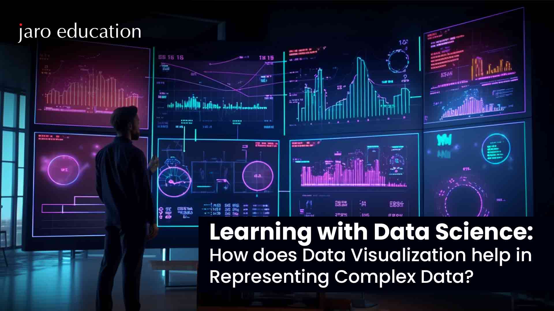
Table Of Content
- What is Data Visualization?
- Importance of Data Visualization in Data Science
- The Role of Data Visualization in Understanding Complex Data in Data Science
- Types of Data Visualization in Data Science
Nowadays, with technology, making these visualizations is much easier. By following a step-by-step process, we can make visuals that not only look good but also make sense to everyone, even those who aren’t tech-savvy. There are different ways to visualize data, like using graphs, charts, and interactive tools. For example, we might use bar graphs to show categories, line graphs for trends over time, and scatter plots to spot patterns.
Interactive dashboards are like customizable screens that let us explore data in real-time. By using these simple yet effective techniques, we can show complex data in a way that everyone understands, helping businesses and decision-makers make smarter choices based on data.
What is Data Visualization?
Data visualization is the practice of presenting data in visual formats like charts, graphs, and maps to facilitate understanding and derive insights. Its primary aim is to help people perceive patterns, trends, and anomalies within large datasets more easily. Data visualization is often used interchangeably with terms like information graphics and statistical graphics.
In the context of data science, visualization is a crucial step after data collection, processing, and analysis. It helps in interpreting the data and making informed decisions. It’s also a key part of data presentation architecture (DPA), which focuses on efficiently managing and delivering data.
Data visualization is valuable across various fields. Educators use it to illustrate student performance, while computer scientists employ it for AI advancements. Executives rely on it to communicate insights effectively. In big data scenarios, where vast amounts of data are involved, visualization tools are essential for gaining quick overviews.
In advanced analytics, visualizing outputs from predictive analytics or ML algorithms is crucial for monitoring performance and ensuring accuracy. Visual representations make complex algorithms easier to understand and interpret, aiding in better decision-making.
Importance of Data Visualization in Data Science
Data visualization holds significant importance in data science for a multitude of reasons. Firstly, it serves as a powerful tool for effectively communicating results and findings to various stakeholders. By presenting data in visual formats, complex information becomes more accessible and understandable, aiding in informed decision-making processes. The data visualization plays a crucial role in the evaluation and monitoring of model performance.
Visualizing metrics and model outputs enables data scientists to identify areas for improvement, conduct hyperparameter tuning, and ensure models are operating optimally. Another key benefit of data visualization is its capacity to uncover trends, patterns, and correlations within datasets. Visual representations make it easier to identify meaningful insights that may not be apparent from raw data alone, leading to more informed analyses and strategic decisions.
Moreover, data visualization facilitates data-cleaning processes, such as outlier detection. Visualizing outliers helps in understanding their impact on overall data integrity and guides corrective actions to maintain data quality. Additionally, data visualization aids in validating model assumptions by visualizing model outputs and comparing them with actual data. This validation process ensures that models accurately reflect real-world scenarios and can be relied upon for decision-making purposes.
Professionals eager to delve deeper into these essential data science competencies will find the “PG Certification Programme in Business Analytics & Applications” by IIM Tiruchirappalli an invaluable resource. Tailored to impart advanced knowledge in business analytics, this program empowers participants with the skills needed to harness data visualization effectively, driving data-driven decision-making and fostering business growth through insightful analyses.
The Role of Data Visualization in Understanding Complex Data in Data Science
Data visualization is a critical component of data science, aiding in the interpretation and communication of complex data. By transforming raw data into visual representations like charts and graphs, data visualization enhances understanding and facilitates decision-making. Let’s explore how data visualization helps in representing complex data and why it is essential in the realm of data science.
1. Enhanced Clarity
Data visualization is a powerful tool that brings clarity to complex datasets, making it easier for data scientists and stakeholders to grasp patterns, trends, and relationships within the data. Through visually appealing charts and interactive dashboards, complex information becomes more accessible and comprehensible.
When dealing with large volumes of data or datasets with numerous variables, the human brain can struggle to process and interpret the information effectively. This is where data visualization comes into play, as it leverages visual elements such as colors, shapes, and patterns to represent data in a way that is more intuitive for the human mind to comprehend.
Moreover, data visualization not only aids in understanding current data but also in communicating insights and findings to stakeholders. Visual representations of data make it easier to convey complex information and support decision-making processes across various domains, including business, healthcare, finance, and more.
2. Pattern Recognition Through Data Visualizations
Data visualizations are essential for pattern recognition, helping data scientists identify patterns and outliers that might not be obvious in raw data. Techniques like scatter plots, heatmaps, and histograms allow for the discovery of hidden insights and a deeper comprehension of the data’s underlying structure.
Scatter plots are effective for identifying relationships and correlations between variables, while heatmaps provide a visual representation of data density and clustering patterns. Histograms help in understanding the distribution of data and identifying outliers or anomalies.
By leveraging these visualization techniques, data scientists can detect patterns that would be challenging to discern through manual analysis alone. This enhances the accuracy of data interpretation and enables informed decision-making based on comprehensive insights derived from the data.
3. Effective Communication
Visual representations are instrumental in enabling data scientists to communicate insights effectively to non-technical audiences. Unlike presenting raw numbers or complex statistical analyses, visualizations offer a clear and engaging method to convey key findings and support decision-making processes.
By utilizing charts, graphs, and interactive dashboards, data scientists can transform complex data into visually intuitive formats that are easily understandable by stakeholders. Visualizations help in highlighting trends, patterns, and correlations, making it simpler for non-technical audiences to grasp the significance of the data.
Visualizations enhance engagement and retention of information, as they provide a visual story that resonates with the audience. This leads to more informed decision-making, as stakeholders can quickly comprehend the insights presented through visualizations and use them to drive strategic actions.
4. Model Performance Monitoring
Monitoring model performance through data visualization is critical in data science, particularly in assessing the effectiveness of machine learning models. Visualizations of model metrics and performance indicators serve as powerful tools for data scientists to track model accuracy, identify areas for improvement, and make informed adjustments to enhance overall model performance.
Visual representations like line charts, bar graphs, and heatmaps enable data scientists to track essential performance metrics such as accuracy, precision, recall, and F1 score over time or across various data subsets. These visualizations offer valuable insights into the model’s performance, highlighting areas of strength and areas for optimization.
5. Trend Identification
Data scientists use exploratory data analysis and interactive visualizations to identify trends and correlations within the data. This process often includes employing clustering and dimensionality reduction techniques to visualize high-dimensional data and extract meaningful insights for business decision-making.
Clustering techniques such as k-means or hierarchical clustering group similar data points, unveiling natural patterns in the data. Visualizing these clusters via scatter plots or heatmaps aids in identifying trends and relationships among variables.
Dimensionality reduction methods like PCA or t-SNE transform high-dimensional data into lower-dimensional representations while preserving critical relationships. Visualizing these reduced dimensions helps uncover hidden trends or patterns in the data’s structure.
Interactive visualizations empower data scientists to explore data dynamically, adjusting parameters to investigate specific trends or correlations. This interactive approach fosters a deeper understanding of the data and supports data-driven decision-making based on actionable insights.
6. Data Cleaning and Validation
Visualizations are instrumental in the data cleaning and validation process, spotlighting missing values, outliers, and data discrepancies. Data scientists rely on visualizations to evaluate data quality, validate assumptions, and guarantee the dataset’s reliability for analysis.
Visualizations can reveal patterns or clusters of missing values, making it easier to identify areas that require data imputation or cleaning. Scatter plots, histograms, and box plots are effective visualizations for detecting outliers, anomalies, or data points that deviate significantly from the norm.
Moreover, by using visualizations for data cleaning and validation, data scientists can identify and address data quality issues early in the data science workflow, leading to more accurate analyses and reliable insights for decision-making.
Types of Data Visualization in Data Science
In data science, various types of data visualization techniques are used to represent and analyze data effectively. Here are some commonly used types of data visualization:
1. Bar Charts
Bar charts are a fundamental type of data visualization used in data science to compare categorical data or display the distribution of data across different categories. They consist of rectangular bars where the length of each bar is proportional to the values it represents. This visual representation makes it easy to visually compare the magnitudes of different categories or data points within a dataset. Bar charts are particularly effective when there are distinct categories or groups to compare, allowing for a quick and clear interpretation of the data’s distribution and trends.
2. Line Charts
Line charts are a powerful data visualization tool used in data science to display trends over time or continuous data points. They connect data points with lines, allowing for clear visualization of changes and patterns in the data. Line charts are ideal for showcasing how data evolves, making it easy to identify trends, correlations, and anomalies. They are particularly useful for visualizing time-series data and comparing multiple datasets on the same chart, providing valuable insights for data analysis and decision-making.
3. Pie Charts
Pie charts are a type of data visualization that represents the composition of a whole by dividing a circle into slices. Each slice represents a proportion of the total data, making it easy to compare different categories or parts of the whole. They are effective for showcasing relative proportions or percentages within a dataset and are valuable for conveying simple comparisons or illustrating the relative importance of different elements. However, they are best suited for datasets with a small number of categories or significant differences in proportions. For complex datasets, other chart types like bar charts may be more appropriate.
4. Histograms
Histograms are data visualizations used to display the distribution of continuous data by grouping data into intervals (bins) and showing the frequency of data points within each interval. They provide insights into data distributions, including measures like central tendency and variability, and are valuable for data analysis and statistical inference, especially when dealing with numerical variables in large datasets.
5. Scatter Plots
Scatter plots visually represent the relationship between two variables, with each data point as a dot on the graph. Patterns and trends, such as positive or negative correlations, can be identified based on the distribution of dots. They are effective for detecting outliers and exploring data relationships. Additional visual elements like color coding enhance insights by representing different categories or groups. Scatter plots are invaluable in data analysis, scientific research, and decision-making, providing a clear and concise way to uncover meaningful insights and make informed decisions based on data patterns and correlations.
6. Heatmaps
Heatmaps visually represent matrix-like data, where each cell’s color corresponds to variable values. They’re effective for identifying patterns and relationships, like in correlation matrices or geographical data. Heatmaps are versatile, used in genetics, business for customer segmentation, and more. They quickly highlight trends, making them invaluable for data analysis and decision-making in various industries.
7. Area Charts
Area charts are visualizations similar to line charts but with filled areas below the lines, making it easier to compare magnitudes of different categories over time. They highlight cumulative data trends and are effective for displaying proportions or stacked data series. Area charts are valuable for illustrating changes in market share, budget allocations, or product category contributions to total sales. They can be enhanced with color gradients and overlaid line graphs for detailed insights. Overall, area charts are versatile tools that facilitate clear comparisons and are useful in data analysis, reporting, and decision-making processes across various industries.
8. Box Plots
Box plots, also known as box-and-whisker plots, are powerful data visualizations that illustrate a dataset’s distribution and identify outliers effectively. They offer a concise summary of essential statistical measures like the median, quartiles (25th and 75th percentiles), and data range. The box represents the interquartile range (IQR), with the median indicated by a line inside. Whiskers extend from the box to the minimum and maximum values within a specified range or based on statistical criteria. Box plots are invaluable for comparing distributions across different groups or variables and pinpointing data points that significantly deviate from the overall pattern, highlighting outliers.
9. Bubble Charts
Bubble charts are an advanced form of scatter plots that add a third dimension by representing data points as bubbles with varying sizes. This size variation allows for the visualization of a third variable alongside the traditional x and y axes. Bubble charts are valuable for visualizing multidimensional data sets, enabling viewers to discern relationships and patterns among three variables simultaneously. They find applications in diverse fields such as finance, environmental science, and economics, where complex data interactions need to be explored. Overall, bubble charts provide a comprehensive and intuitive way to analyze and understand complex data relationships in a visual format.
10. TreeMaps
Treemaps are visualizations that portray hierarchical data structures by representing each category as a rectangle. The size of each rectangle corresponds to a specific variable like revenue or frequency. Treemaps offer a clear overview of dataset composition and relative category proportions within the hierarchy. They are crucial for visualizing intricate data relationships and pinpointing areas of focus or significance. Treemaps have diverse applications in finance, business analytics, and retail, providing a succinct and intuitive method to analyze hierarchical data structures and drive informed decision-making based on data insights.
Final Words
In summary, data visualization is a crucial aspect of data science that transforms complex data into visually intuitive representations, facilitating understanding and informed decision-making. From bar charts to interactive dashboards and advanced techniques like heatmaps and scatter plots, visualization tools empower us to uncover insights, identify patterns, and communicate findings effectively. With technology advancements, creating impactful visualizations has become accessible to all, enabling us to monitor model performance, identify trends, and validate assumptions throughout the data science workflow. Mastering data visualization is essential for navigating vast datasets, extracting actionable insights, and driving innovation across industries.
For individuals keen on enhancing their data visualization skills and delving deeper into the realm of data science, the Post Graduate Certification Programme in Business Analytics & Applications,offered by IIM Tiruchirappalli presents an excellent opportunity. This course equips participants with the knowledge and tools necessary to excel in data visualization, data analysis, and business analytics, enabling them to make informed decisions and drive business success.


Find a Program made just for YOU
We'll help you find the right fit for your solution. Let's get you connected with the perfect solution.

Is Your Upskilling Effort worth it?

Are Your Skills Meeting Job Demands?

Experience Lifelong Learning and Connect with Like-minded Professionals

