Five Data Visualization Techniques to Boost the Careers of Beginners

Table Of Content
- Why visualization skills move careers faster
- Tools to Learn: Practical, Beginner-friendly Roadmap
- How to practice so it helps your career
- Common beginner mistakes and how to fix them
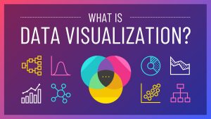
Data visualization is the bridge between raw data and real decisions, and for beginners, learning a handful of dependable techniques can be the quickest way from "I can plot" to "I'm valuable." Here, we will walk you through five practical data visualization techniques which junior analysts, new data scientists, and early-career professionals can easily learn and apply quickly in order to make their work clearer, more persuasive, and career-advancing. Along the way, we will provide reference approaches and best practices emphasized by top industries so you get guidance that's both tactical and aligned with the field.
Why visualization skills move careers faster
*Venngage
Technique 1 — Start with simple, high-signal charts: bar, line, scatter
Beginners should own the fundamentals: bar charts for comparisons, line charts for trends, and scatter plots for relationships. These are the visual vocabulary most stakeholders instantly understand. Start with these, then iterate. Mastery here means knowing which chart answers which question and how to label axes, choose sensible scales, and add a single clear insight on the plot. Mastering these core data visualization skills will make your reports readable and your conclusions believable. Indeed, many leading guides recommend starting simple and adding nuance rather than overcomplicating the visualization.
Practical tip: when in doubt, use a bar chart for category comparisons, a line chart for time series, and a scatter plot when exploring correlation or clusters. Beginners who get these three right are already ahead of many teams.
Technique 2 – Use dashboards to tell a short story (KPIs + context)
A single chart can show one insight; a compact dashboard can tell a short, focused story. For career growth, build dashboards that highlight 2-4 KPIs and show context (trend, comparison, and a drill-down). Knowing how to design an effective dashboard – arranging visuals by priority, using small multiples for repeated metrics, and keeping interactions simple – is a skill that gets noticed by product managers and business stakeholders. Learning data visualization techniques for the dashboard and which data visualization tools and techniques make building them fast will amplify your impact (Tableau, Power BI, Looker). Industry pieces emphasize clarity: “dashboards are for decisions, not decoration.”
Practical tip: Start with a one-screen dashboard that answers one business question; for instance: “Are sales improving in the top 5 regions?” Use a headline KPI, a trend line, and one comparative bar chart.
Technique 3 — Storytelling and annotation
Visuals without narrative are noise. The best junior visualizers pair charts with a clear headline, one-sentence takeaway, and annotations that point to the specific data features supporting that takeaway. Storytelling with data helps non-technical stakeholders act on your work — and that’s exactly the behaviour that accelerates responsibility and promotions. Practice crafting a single-sentence insight for every chart you create; this is one of the simplest data visualization techniques that delivers outsized career benefits. Top blogs repeatedly call out annotation and narrative as central to effective visualization.
Practical tip: add a single callout on the chart – something like “Campaign launched here → 18% lift” – so a reader’s eye goes directly to the point.
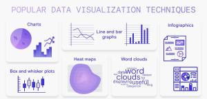
Technique 4 — Use the right specialized visual for the problem — heatmaps, boxplots, waterfall
Once you’re comfortable with the basics, expand into a few specialized charts that frequently solve real problems:
Heatmaps for correlations and intensity across categories, such as website click density or sales by hour/day.
Box plots for distribution and outlier detection: great for salary distributions or A/B test results.
Waterfall charts for decomposing changes between periods or between budget vs. actual Knowing when to swap a basic chart for a specialized one is a mark of an intermediate-level practitioner; beginners who add two or three of these to their toolkit quickly increase their analytical value. These data visualization techniques, data visualization tools, and techniques are those commonly recommended in practical guides for analysts. Practical tip: learn one specialized chart per month. Build a small project in which you use it so you understand data-prep, interpretation, and messaging.
*RudderStack
Technique 5: Make reproducible, clean visuals (code + templates)
Career growth is about scaling work: Reusable scripts and presentation templates let you replicate high-quality visuals in a lot less time. Learn a plotting library or a business tool and make standard templates; for example, a reporting script in Python using Matplotlib/Seaborn/Plotly or a Power BI / Tableau workbook. Reproducibility reduces errors and displays that you think like an engineer-a big plus for promotion. Time spent learning the different reproducible data visualization techniques and which data visualization tools and techniques support automation pays off in credibility and time saved. Most industry tutorials emphasize reproducibility and repeatability in professional analytics.
Practical tip: store a “visual template” folder with 3-4 ready plots (PNG + code/notebook + short README) so that you can spin up polished visuals in minutes.
Tools to Learn: Practical, Beginner-friendly Roadmap
Coding path:
Python-.Material from Matplotlib to Seaborn to Plotly or R-ggplot2. These give you full reproducibility.
No-code / BI path:
Tableau and Power BI are both widely used in business, letting you build dashboards with drag-and-drop ease.
Supporting tools:
Excel/Google Sheets for quick ad hoc visuals, and learning basic SQL to retrieve clean data.
Knowing which data visualization tools and techniques to use for which situation makes you a reliable team player. Many industry guides group the tools by user level and by use case to help a newcomer decide where to start.
Practical tip:
select at least one tool in each route, for example: learn Python + Plotly for reproducible analyses and Power BI for stakeholder facing dashboards.
How to practice so it helps your career
Small public projects:
publish a small dashboard or an explainer chart on GitHub, LinkedIn, or a blog (this becomes evidence during interviews).
Recreate high-quality examples:
pick a visual from the top blog or dashboard and rebuild it — reverse-engineering teaches craft.
Weekly micro-challenges:
set a habit of one chart per week, for example via Storytelling With Data exercises. This builds fluency in data visualization techniques and the data visualization tools and techniques you use. Practical tip: include a short “how I made this” note with each public project that lists tools, data prep steps, and trade-offs you made.
Common beginner mistakes and how to fix them
Wrong chart type: if stakeholders ask “what am I looking at?” you picked the wrong visual; choose a simpler chart.
No story – just always include a headline takeaway and one annotated point.
Not validating with stakeholders: demo early; their feedback will show whether the chart matches the decision needed. These simple corrections align directly with best-practice advice from leading data visualization resources.
Measuring the career impact
Quick 30-day learning plan: beginner → confident contributor
- Week 1: Basics — bars, lines, scatter. Recreate three charts.
- Week 2: Dashboards – Build a one-screen KPI dashboard in Power BI or Tableau.
- Week 3: Storytelling — annotate charts and write one-sentence takeaways.
- Week 4: Advanced + reproducible – learn one boxplot/heatmap and script it in Python or save templates in your BI tool.
This targeted practice is how beginners become the team members asked to present the results-and that exposure accelerates career growth.
Final thoughts
For beginners, the fastest career wins come from clarity and reliability. Master the basic charts, learn one dashboard tool, practice storytelling, add a couple of specialized plots to your toolkit, and make your work reproducible. These five data visualization techniques — and learning which data visualization tools and techniques best support them — will move you from ad-hoc plotting to trusted analyst in months, not years.
Frequently Asked Questions
The five steps of data visualization are to gather data, clean it, choose appropriate visuals, design the chart, and interpret insights. Clarity, accuracy, and impact in your visuals are guaranteed if you keep these data visualization techniques in mind.

Find a Program made just for YOU
We'll help you find the right fit for your solution. Let's get you connected with the perfect solution.

Is Your Upskilling Effort worth it?

Are Your Skills Meeting Job Demands?

Experience Lifelong Learning and Connect with Like-minded Professionals

