- jaro education
- 1, January 2024
- 9:00 am
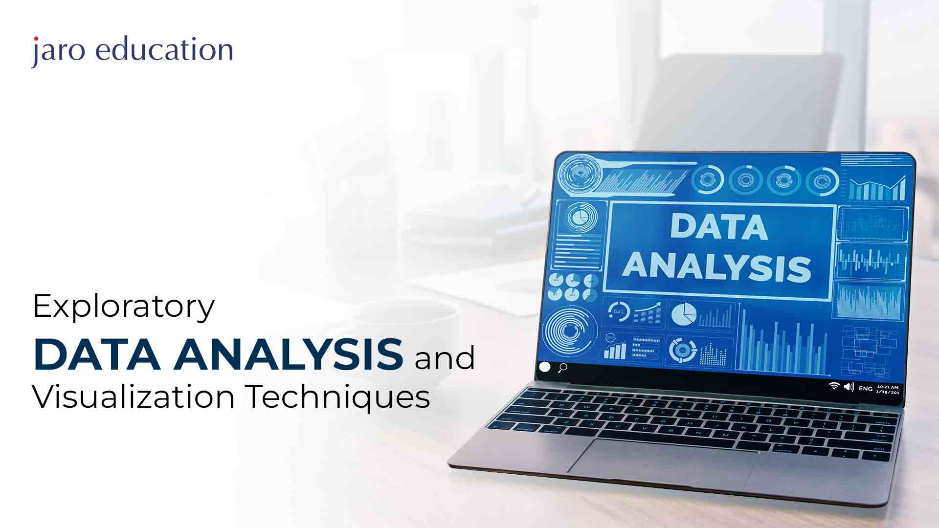
Tableau is an advanced data analysis and visualisation tool that helps present data clearly and beautifully. It links to numerous sources, like databases, files, online services, and the cloud. With these connections, it builds visually pleasing items like charts, maps, tables, and filters. Using Tableau, you can perform “visual analytics.” This means you can use graphics and interactions to understand your data. You can also make interactive dashboards to show different views of your data. This improves the user experience and makes exploring data easier. Tableau is favoured by many people and businesses interested in data analysis and intelligence.
Having a grip on Tableau can help you leverage success in the field of advanced analytics. It equips you with a dynamic toolset to proficiently visualise and analyse complex datasets. Going through a professional course like the Certificate Programme in Advanced Analytics and BI program by IIM Kozhikode can be your ultimate guide to learning the complex aspects of Tableau and gaining a competitive edge in the constantly evolving field. Join this Tableau online course and get ready to have a bright future in data analytics.
Table of Contents
Main Features of Tableau
Tableau is a data visualisation software that makes it easy to display and analyse your information graphically. The Tabulae, with its various attributes, turns out to be a critical and competent business intelligence solution that can deliver the analysis process effectively. Some of the main features of Tableau are:

*data-flair.training
Advanced dashboard
You can create customised interactive dashboards with which to visualise key elements drawn from your data (including but not limited to charts, maps, images, and drop-down filters) using Tableau. In addition, the action, parameters, and story can be added to dashboards to make them more appealing and meaningful.
Security system
The table has a sophisticated security system. Thus, it allows you to deny individuals in viewing, editing, or even updating information within the data set and charts. Furthermore, you can integrate it with your existing authentication and authorisation approaches, such as Active Directory, LDAP, SAML, or OAuth, among others.
In-Memory and Live Data
Thus, Tableau connects with most data sources, such as databases, files, web services, among others, and cloud platforms. You can import your data into a very powerful memory engine in Tableau, which means that you will not need a lot of processing power even if the set of your data is large. Alternatively, you could connect to live updating data where you can see your input in real-time.
Attractive visualisations
They enable the creation of inspiring and moving graphical models that help analyse, comprehend, and visualise information. It provides various means of visualisation, such as bar charts, line charts, pie charts, scatter plots, heat maps, treemaps, and many others. You can also customise different visuals for colours, different styles of illustrations, labelling, tooltips, and annotations.
Visual analytics
With Tableau, you can carry out visual analysis of your data using visual graphical elements and interactivity to reveal meaningful findings. You can also manipulate, transform, or compare your data by employing features such as drag-and-drop, filters, highlights, sorting, grouping, calculations, and so on using Tableau. Finally, one can mention the level of detail expressions, parameters actions, set actions, and table calculations used in Tabulation to help perform difficult, complex analyses.
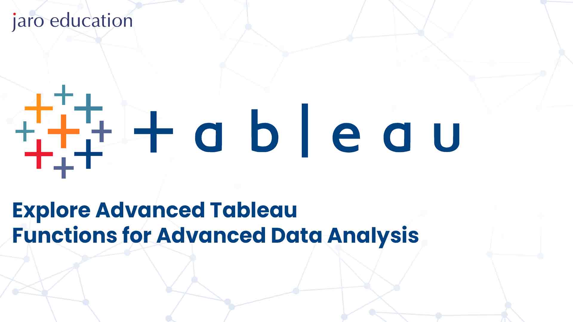
Advanced Tableau Functions
One can easily present and analyse data attractively by utilising Tableau. There are a lot of available functions you could apply to your data for mathematical, logical, string, time, aggregated data, or spatial calculations using the tool. With these operations, you will be able to play with your data in varied shapes, such as manipulation, transformation, filtering, grouping, and summation. Some of the advanced Tableau functions that you can use for advanced data analysis are:
Segmentation and cohort analysis
There are two important ways to understand your customer’s behaviour, which include segmentation and cohort analysis in particular. In this case, segmentation refers to slicing your customers into groups based on specific attributes like age, sex, location, etc. and cohort analysis means observing how this group behaves concerning matters related to retentions or churns.
Using groups, sets, and parameters, Tableau enables segmentation and Cohort Analysis. A group is one or more dimension elements created manually, conditionally, or from other sources. These are dimension member sets, which you may define by using a condition or by evaluating a calculation. Parameters are a set of values that change, and you can use them for filtering, sorting, and calculating your data. Such as establishing a group of customers whose purchasing frequency is more significant than one per month and defining the specific period that should be considered when conducting cohort analysis. Afterwards, you can use these features to create a dashboard with the retention rate, average order value, and customer lifetime value of every segment and cohort.
Parameter actions
A newer feature for Tableau is parameter actions, which enable changing the value of parameters by making user interaction like clicking, hovering or selecting marks on visualisation. Therefore, parameter actions will assist you in coming up with dynamic and interactive panels that consider various inputs, resulting in specific interpretations.
For instance, you could add a parameter that will give the same colour bar chart according to a measure like sales, profits or quantities. Once you’ve built this parameter, you can create a parameter action that will change the value of your parameter according to the measure the user selects through a pull-down menu. By doing so, the user can select whether to view the bar chart in the same colour code or not and easily make comparisons between various indicators.
Set actions
Another new feature here is set actions within Tableau, which allows changing the established members due to a user action, for example, clicking, hovering or selecting a mark on the visualisation. Use set steps to make your dashboard come alive by enabling it to highlight, filter, or even drill down in the data dynamically according to user input.
For instance, you can develop a collection of products more significant than the average sale price and paint the spot chart of sales against profit. After this, you make an action set which alters the member sets according to the products the user chooses from the list. In this manner, you can let the users define their colour encoding to the scatter plot for exploration within various goods segments.
Level of detail expressions
A high-profile feature in Tableau known as the level of detail expressions enables you to make calculations at various degrees of clarity irrespective of the degree of details of the illustrations. Detail-level presentations could assist you in carrying out complicated and advanced data analyses such as aggregation, comparison, or ratio analyses.
As a result, you may calculate the average sales per customer, regional share of total sales, and a deviation between projected and actual sales. In addition, you can generate level-of-detail expressions for developing additional custom dimensions depending on your needs, like customer segments, product categories, and time frames.
Dual axis charts
The dual-axis chart is one of Tableau’s many kinds of charts, which can display combinations like bar and line, scatter plots, and map charts on a single visualisation. You can use dual-axis charts to show two measures/dimensions on one axis or compare two features in one dataset.
For instance, you can plot dual-axis charts depicting each product’s sales and the profit margin on a bar chart or the population and the GDP per country displayed on a map. Further, more sophisticated visualisation techniques like lollipop charts, bullet charts and slope charts can be created using dual-axis charts.
Why Learn Data Visualisation in Tableau?
visualisation of data means converting plain text information into easily interpreted graphic and interactive representations that enable viewing, analysis and storytelling. Data visualisation can help you:
Discover insights
One way of unmasking details such as patterns, trends, outliers, and relations, among others, is through data visualisation. You can also use data visualisation in testing hypotheses, validating assumptions and answering questions pertaining to the data.
Communicate findings
The method uses data visualisation to make your information brief, straightforward but appealing. Visualising data will enable you to narrate stories, present an argument, or persuade people using information.
Make decisions
Visualising data in this way will allow you to make informed and evidence-based decisions using the acquired data. You may also use data visualisation to control and make sense of the consequences and results of your choices.
Tableau is perhaps the best-known and most effective platform for data visualisation on the market. Tableau can help you learn and master data visualisation for the following reasons:
Easy to use
Tableau is very easy to use because of its drag-and-drop, filter, highlighter, and other functionalities capabilities. You no longer need to be a software programmer or have any technical abilities to configure the functions of Tableau. There is an option of having access to a variety of online resources or tutorials by Tableau, which one might use to get more knowledge or practice to master their skills.
Flexible and versatile
It can connect to different data sources like databases, files, web services and also the cloud platforms. Alternatively, you may upload your data into a tablet’s engine that allows processing large volumes of data at a high speed or connect real-time to data. However, Tableau also has visualisation types ranging from bar, line, pie, scatter plots, heat maps, and tree maps, as well as others. Also, you can use colour, shape, labelling, tooltips, and annotation in your visualisations.
Advanced and sophisticated
This software contains level-of-detail expressions, parameter actions, set actions, and table calculations, which can be used for more complicated and advanced analysis of the data. Dashboards, spatial functions, and security systems in Tableau will enable you to produce interactive and secure dashboards and geospatial analysis. The Tableau consists of data visualisation facilities, stories, and animation functions that allow you to visually analyse your data and give your story.
Conclusion
Tableau is known as an adaptable and customisable data representation software that can assist in complicated analytical operations involving different capabilities and characteristics. In this article, we have looked at how you can use some of the advanced Tableau features to group your customers, develop interactive user dashboards, and perform roll-up or drill-down calculations, among others. These functions will help you improve your data exploration and discovery and communicate your findings well.
For advanced data analysis with Tableau, you may consider enrolling in Professional Certificate Programme in Advanced Analytics & Business Intelligence by IIM Kozhikode. This programme will enable you to master Tableau and prepare adequately for a series of official Tableau certification exams. You could also expect lessons on data analytics, business intelligence, and data storytelling. Access to live webinars, cases, project work, and guidance will be provided by leading specialists. Additionally, you will earn a Certificate of Completion from IIM Kozhikode Institute, ranked among India’s best business institutions. For further information about the program, contact Jaro Education.
Trending Blogs