Mastering Data Visuals Using Tableau: Explained
Table Of Content
- The World of Data Visualization
- What is Tableau?
- Significance of Data Visualization with Tableau
- Getting Started with Your Tableau Journey
Tableau transforms data into eye-catching pictures to unlock the power of data visualization. It uses the enhanced comprehension capabilities of graphs, maps, and graphical elements. Visualisations have been demonstrated to be useful throughout history in understanding difficult content and overcoming the limitations of just words. Tableau’s data visualization technology enables decision-makers to see significant patterns amidst many variables as data volumes grow. It allows them to discuss concepts, test theories, and make wise decisions in the future. By actively integrating users, modifying data on the go, and providing spectacular real-time insights, Interactive Visualisation takes it further than static representations.
To understand Tableau and learn about various facets of advanced analytics enrolling in the Professional Certificate Programme in Advanced Analytics & Business Intelligence – IIM Kozhikode can be of immense help. This career-enhancing programme’s rigorous theoretical and hands-on instruction includes a range of data processing methods, programming with software, statistics, machine learning, and more. This curriculum combines experiential live interactive classes with on-campus immersive learning to provide a balance between conventional classroom instruction and technology-enhanced learning.
Let us further dive into the world of data visualization using tableau.
The World of Data Visualization
What is Tableau?
Significance of Data Visualization with Tableau
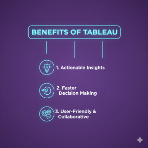
- Enhanced Clarity and Insight: Visualization facilitates clear comprehension and deeper insights into complex topics.
- Accelerated Decision-Making: The prediction of future trends and insights on more informed decision-making are simplified with data visualization.
- Swift Identification of Large Data Volumes: Visual representations enable efficient and rapid identification of patterns and insights within extensive datasets.
- Universal Information Communication: Data visualization is a universal language for conveying information, ensuring effective communication across diverse audiences.
- Ease of Idea Sharing: Visualizing data simplifies sharing ideas with others, fostering collaboration and promoting a shared understanding.
- Business Adjustment Guidance: By visualizing data, individuals gain valuable insights into areas where adjustments can be made to optimise business outcomes.
- Scalability: The data visualization provides the flexibility and scalability to handle large and expanding datasets.
- Simplified Interpretation: Visual representations make data interpretation more accessible, enabling stakeholders to extract meaning more easily.

Getting Started with Your Tableau Journey
Crafting Foundational Visualizations
Elevating Visualizations with Tableau’s Extraordinary Features
Amplifying Tableau’s Potential Through Integration
Best Practices for Effective Tableau Visualization
- Select chart types based on data relevance.
- Avoid unnecessary clutter or over-styling.
- Keep a logical flow in dashboard layouts.
- Highlight key metrics by using color judiciously.
Following these best practices ensures that the data visualization Tableau efforts are not only aesthetically pleasing but also strong from an analytical perspective. These key principles will make data visualization with Tableau impactful for all levels of decision-makers.
Key Features That Make Tableau the Industry Leader
Future Trends in Data Visualization Using Tableau
Conclusion
Data visualization using Tableau emerges as a powerful instrument for transforming raw data into meaningful insights. With its user-friendly interface, extensive visualisation options, and advanced features, Tableau empowers users to create interactive dashboards and reports, facilitating data-driven decision-making. By leveraging Tableau’s exceptional capabilities, you can unlock the true potential of your data and effectively communicate insights.
You can sign up for the Professional Certificate Programme in Advanced Analytics & Business Intelligence through Jaro Education to ensure a successful future in the area of advanced analytics.
Frequently Asked Questions
The five steps of data visualization are to gather data, clean it, choose appropriate visuals, design the chart, and interpret insights. Clarity, accuracy, and impact in your visuals are guaranteed if you keep these data visualization techniques in mind.

Find a Program made just for YOU
We'll help you find the right fit for your solution. Let's get you connected with the perfect solution.
Is Your Upskilling Effort worth it?

Are Your Skills Meeting Job Demands?

Experience Lifelong Learning and Connect with Like-minded Professionals

