Data Interpretation: Methods, Types & Easy Examples

Table Of Content
- Everything You Must Know About Data Interpretation
- Methods of Data Interpretation
- Types of Data Interpretation
- Data Interpretation Detailed Examples
Do you know, the global data analytics market is projected to exceed USD 650 billion by 2030?
This figure indicates an explosive demand for professionals who can navigate complex datasets through powerful interpretation techniques. Basically, whether you're analysing dashboards, solving data interpretation questions, or driving strategic initiatives, these skills are now a career catalyst, that too irrespective of the industry.
This blog is your go-to guide, covering what is data interpretation, its methods, types, frameworks, and illustrative examples to help you master the fundamentals.
Everything You Must Know About Data Interpretation
Definition:
The process of reviewing, analysing, and translating raw information into meaningful insights that support informed decision-making.
Interesting Insight:
Did you know? Studies reveal that nearly 75% of business decisions fail due to poor data analysis and interpretation. Organisations with strong data-interpretation capabilities outperform peers by up to 3x in operational efficiency and strategic outcomes.
What Is Data Interpretation?
At its core, data interpretation is the structured process of transforming data findings into practical insights. While data analysis focuses on exploring, cleaning, and modelling data, interpretation focuses on deriving meaning, identifying patterns, and explaining implications.
Simply put:
Analysis tells you what the data shows; interpretation tells you why it matters.
Professionals use this competency to answer critical questions, validate hypotheses, and support both tactical and strategic business decisions. It also forms the backbone of competitive test preparation where data interpretation questions are widely used to evaluate analytical reasoning.
Why Data Interpretation Matters Today:
- Decision-makers rely on it to reduce uncertainty.
- Organisations need it to evaluate KPIs and optimise investments.
- Analysts use it to run insights-driven business strategies.
- Students and professionals apply it to competitive exams and case-based assessments.
Tech, BFSI, IT, Consulting, Healthcare, Retail, and Education depend on data analysis and interpretation to convert information into competitive advantage.
Methods of Data Interpretation
 *edurev.in
Data interpretation methods are categorised based on how insights are processed and conclusions are drawn. Understanding these helps professionals select the most suitable approach.
The different data interpretation methods are:
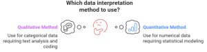
1. Quantitative Interpretation
Focuses on numerical, measurable data. Widely used in financial modelling, forecasts, dashboards, and scoring-based questions.
Key Techniques:
- Percentage change analysis
- Trend analysis
- Ratio comparisons
- Regression insights
- Statistical summaries (mean, median, variance)
2. Qualitative Interpretation
Focuses on non-numerical information, descriptions, patterns, behaviours, or sentiment.
Key Techniques:
- Thematic analysis
- Pattern recognition
- Sentiment clustering
- Contextual mapping
3. Comparative Interpretation
Used for scenarios requiring multi-variable or multi-group comparisons, crucial for business reporting and exam-level data interpretation questions.
Key Techniques:
- Cross-category comparison
- Multi-variable evaluation
- Gap analysis
- Performance benchmarking
4. Predictive Interpretation
Combines historical datasets with models to infer future trends. Often integrated into data analysis and interpretation for forecasting.
Key Techniques:
- Trend projection
- Regression modelling
- Time-series forecasting
- Pattern extrapolation
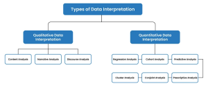
Types of Data Interpretation
 *intellipaat.com
Understanding each data interpretation type helps interpret information differently, depending on the dataset, objective, and complexity of insights required.
Below is a comprehensive breakdown of the most widely used types:
1. Tabular Data Interpretation
Tabular interpretation centres on analysing datasets organized in rows and columns. It is one of the most practical formats because it mirrors how organisations maintain operational, financial, and performance data.
Common Uses:
- Revenue and profit tables
- Quarterly/annual performance scorecards
- Inventory and logistics sheets
- Financial statements (P&L, balance sheet)
- Customer segmentation tables
Interpretation Approach:
- Identify base values clearly
- Compare row-wise and column-wise changes
- Calculate percentages, ratios, and absolute differences
- Look for emerging patterns, outliers, and trend behaviour
2. Bar Graph Data Interpretation
Bar graphs use vertical or horizontal bars to represent values, making category-wise comparisons highly intuitive. They remain one of the most frequently tested formats in data interpretation questions.
Common Uses:
- Market share comparisons
- Regional sales or growth metrics
- Product-line performance
- Year-on-year (YoY) revenue comparisons
Interpretation Approach:
- Compare bar heights directly
- Analyse gaps between categories or years
- Identify highest and lowest performers
- Track mobility, improvements, or declines across periods
3. Line Graph Data Interpretation
Line graphs visualise trends over time, making them vital for forecasting and performance monitoring. They provide clarity on how variables behave throughout multiple time intervals.
Common Uses:
- Stock price movement analysis
- Monthly or quarterly sales trends
- Website traffic or engagement analytics
- Climate or environmental pattern tracking
Interpretation Approach:
- Analyse slopes to spot sharp rises or declines
- Detect recurring seasonal spikes
- Compare multiple lines for multi-product assessments
- Identify sudden anomalies or disruptions
4. Pie Chart Data Interpretation
Pie charts represent the proportional contribution of categories to a whole. They offer quick clarity on distribution patterns and are commonly used in introductory data interpretation formats.
Common Uses:
- Budget or cost allocation
- Market share distribution
- Resource utilisation mapping
- Expense analysis
Interpretation Approach:
- Identify largest and smallest contributions
- Compare slices to evaluate dominance
- Focus on percentage-based differences rather than visual size alone
5. Mixed Graphs Interpretation
Mixed graphs combine multiple visual formats commonly bar + line, table + bar, or line + area chart. These appear heavily in corporate analytics because they consolidate multiple variables.
Common Uses:
- Sales volume (bar) + revenue growth (line)
- Profit margins table + region-wise bar comparison
- Customer count line graph + churn bar chart
Interpretation Approach:
- Separate each visual component before analysing
- Evaluate variables individually
- Integrate insights to form a holistic conclusion
6. Caselet / Paragraph-Based Data Interpretation
Caselets embed data within a narrative, requiring comprehension, extraction, and computation. The test applied reasoning more than direct visual reading.
Common Uses:
- Business case analyses
- Consulting problem-solving
- CAT/GMAT exam caselets
- Managerial or situational decision-making
Interpretation Approach:
- Extract key facts and figures from the passage
- Identify relevant variables
- Build a quick mental or written table
- Solve comparative, ratio-based, or percentage problems
7. Radar Chart / Spider Graph Interpretation
Radar charts help evaluate multiple metrics simultaneously for one or several entities. They provide a multi-dimensional view of performance or attributes.
Common Uses:
- Employee competency assessment
- Product feature benchmarking
- Customer satisfaction across dimensions
- Portfolio performance review
Interpretation Approach:
- Identify spikes and dips across axes
- Compare symmetry of shapes
- Locate overall strength–weakness clusters
8. Scatter Plot Interpretation
Scatter plots show relationships between two numerical variables to understand patterns or correlations. They play a major role in statistical modelling and risk evaluation.
Common Uses:
- Credit risk modelling
- Market trend identification
- Research and survey analysis
- Operational optimisation studies
Interpretation Approach:
- Identify clusters or patterns
- Observe direction of the trend line (positive/negative)
- Spot outliers or anomalies
- Assess strength of correlation
9. Histogram Interpretation
Histograms display frequency distribution across value ranges and are essential for understanding data spread, variability, and concentration.
Common Uses:
- Quality control and defect distribution
- Demographic or customer profile analysis
- Performance scoring ranges
- Financial risk spread evaluation
Interpretation Approach:
- Identify the modal range (highest frequency)
- Evaluate range spread and distribution shape
- Assess skewness (left/right)
- Look for clustering or unusual concentration patterns
10. Heatmap Interpretation
Heatmaps use colour gradients to represent intensity, density, or activity levels. They are widely used in modern digital analytics.
Common Uses:
- Website behaviour tracking (scroll/click heatmaps)
- Risk intensity mapping
- Performance metrics
- Resource utilisation across teams or departments
Interpretation Approach:
- Identify high-density colour zones
- Compare intensity clusters
- Examine anomalies or unexpected hotspots
Data Interpretation Detailed Examples
Example 1: Table-Based Question (Step-by-Step Interpretation)
Tabular questions are among the most widely used formats in corporate dashboards and exams because they present raw data directly. The ability to compare rows, assess growth, and identify trends forms the backbone of strong data interpretation skills.
| Quarter | North | South | East | West |
| Q1 | 1200 | 900 | 1100 | 800 |
| Q2 | 1500 | 950 | 1400 | 900 |
| Q3 | 1700 | 1100 | 1450 | 1050 |
| Q4 | 2000 | 1250 | 1600 | 1150 |
Question: By what percentage did North region sales grow from Q1 to Q4?
Step-by-step solution approach:
- Identify initial and final values
- Q1 North Sales = 1200
- Q4 North Sales = 2000
- Calculate absolute growth
Growth = Final – Initial
Growth = 2000 – 1200 = 800 units - Calculate percentage growth
Percentage Growth = (Growth ÷ Initial) × 100
Percentage Growth = (800 ÷ 1200) × 100
Percentage Growth = 66.67%
Example 2: Bar Graph Question (Understanding Category Trends)
Bar graph-based questions are useful for category comparisons and trend evaluations. They are easy to visually interpret but often require additional calculation to derive meaningful insights.
Scenario: Employee satisfaction scores over four years
A company measured employee satisfaction on a percentage scale across four consecutive years:
- Year 1: 70%
- Year 2: 75%
- Year 3: 82%
- Year 4: 80%
Question: What is the average satisfaction score across all four years?
Step-by-step solution approach:
- Add all values
Total = 70 + 75 + 82 + 80 = 307 - Divide by the number of years
Average = 307 ÷ 4 = 76.75%
Example 3: Pie Chart Question (Understanding Proportions & Contribution)
Pie chart questions appear frequently in both exam modules and business reporting because they simplify the understanding of proportions. They help determine which categories dominate or underperform.
Scenario: Investment distribution across five divisions
A company allocates its annual investment budget as follows:
- Division A: 25%
- Division B: 20%
- Division C: 15%
- Division D: 25%
- Division E: 15%
Question: Which division receives the highest allocation?
Answer: Both Division A and Division D, each receiving 25%, have the highest allocation.
Skills Required for Effective Data Interpretation
- Strong Numerical Reasoning: Essential for handling percentages, ratios, averages, and comparison-based data interpretation questions with precision.
- Critical Thinking Ability: Helps challenge assumptions, validate insights, and interpret results beyond surface-level observations.
- Pattern Recognition: Enables quick identification of trends, correlations, anomalies, and behavioural shifts hidden within raw data.
- Attention to Detail: Prevents errors that arise from misreading scales, units, or labels, crucial for reliable data analysis and interpretation.
- Visual Literacy: Supports accurate reading of graphs, heatmaps, dashboards, and complex visual representations.
- Basic Statistical Understanding: Concepts like variance, correlation, and regression strengthen analytical depth and improve interpretation quality.
Together, these skills empower professionals to transform raw information into actionable insights, driving smarter decisions across industries.
Data Analysis and Interpretation in the Real World
- Finance: Portfolio evaluation, credit scoring, risk matrices
- Retail: Consumer segmentation, demand forecasting
- Telecom: Churn prediction, network optimisation
- Healthcare: Diagnostic mapping, treatment efficiency tracking
- IT & Analytics: Dashboard building, anomaly detection
- Manufacturing: Process optimisation, quality audits
By integrating analytical models with data interpretation frameworks, companies accelerate decision cycles and ensure accountability across functions
How to Approach Data Interpretation Questions
1. Understand the Dataset
Scan the graph/table thoroughly to identify:
- Units
- Categories
- Trends
- Outliers
2. Identify the Expectation
Clarify whether the question requires:
- Comparison
- Calculation
- Ratio formation
- Trend evaluation
- Forecasting
3. Apply the Most Suitable Method
Choose from percentage analysis, addition, ratio, difference, or approximation.
4. Avoid Calculation Traps
In exams, estimates often speed up answering data interpretation questions by up to 40%.
5. Cross-Validate the Answer
Check for:
- Unit mismatch
- Base value errors
- Percentage misinterpretation
Common Challenges & Their Solutions
1. Misreading Visuals
Fix: Start with the legend, axis labels, and units.
2. Overlooking Hidden Patterns
Fix: Compare across years/categories, not only within a single parameter.
3. Time Pressure
Fix: Adopt rapid-calculation frameworks (percentage change, approximations, ratio shortcuts).
4. Information Overload
Fix: Break large datasets into clusters or segments before drawing conclusions.
Advance Your Data Interpretation Skills with Jaro Education
At Jaro, we understand the growing demand for strong data interpretation skills across today’s data-driven careers. That’s why we bring you a diverse portfolio of programmes ranging from MBAs to specialised executive certifications.
One such programme specifically tailored for data-focused professionals is the Post Graduate Certification Programme in Business Analytics & Applications – IIM Tiruchirappal, designed to build deep analytical capability through real-world business frameworks.
Why learners choose Jaro:
- We collaborate with top-tier institutes
- Our curriculum blends theory with real business data
- Flexible formats suited for working professionals
- Strong credibility backed by thousands of successful alumni
Ready to upgrade your analytics career? Join us at Jaro Education and start your journey today.
Final Thought
Mastering data interpretation unlocks strategic clarity in an age where businesses compete purely on insight velocity. Whether you’re solving analytical problems, interpreting charts, or steering enterprise-wide initiatives, this competency separates high-impact professionals from the rest.
Frequently Asked Questions
Data interpretation are easy to moderate if you follow structured techniques such as percentage change, approximation, and comparative analysis.

Find a Program made just for YOU
We'll help you find the right fit for your solution. Let's get you connected with the perfect solution.
Is Your Upskilling Effort worth it?

Are Your Skills Meeting Job Demands?

Experience Lifelong Learning and Connect with Like-minded Professionals

