

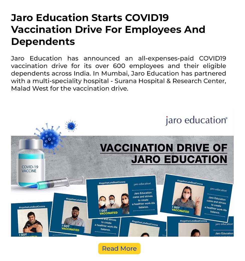
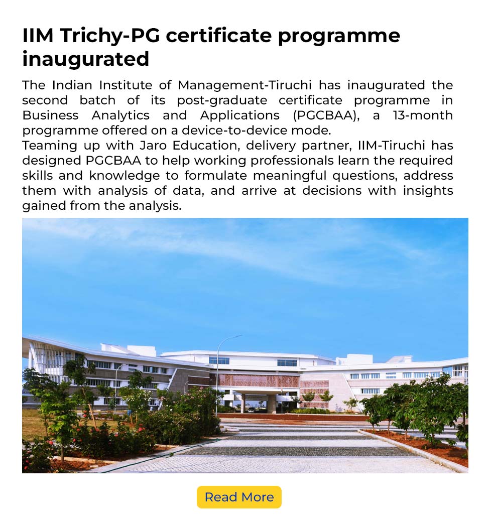
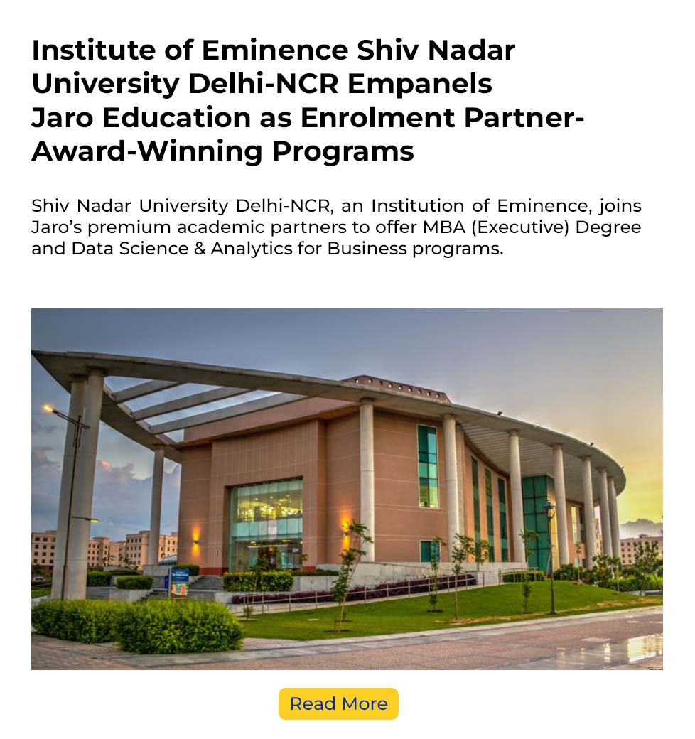
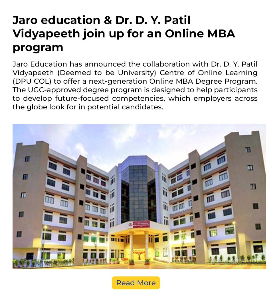
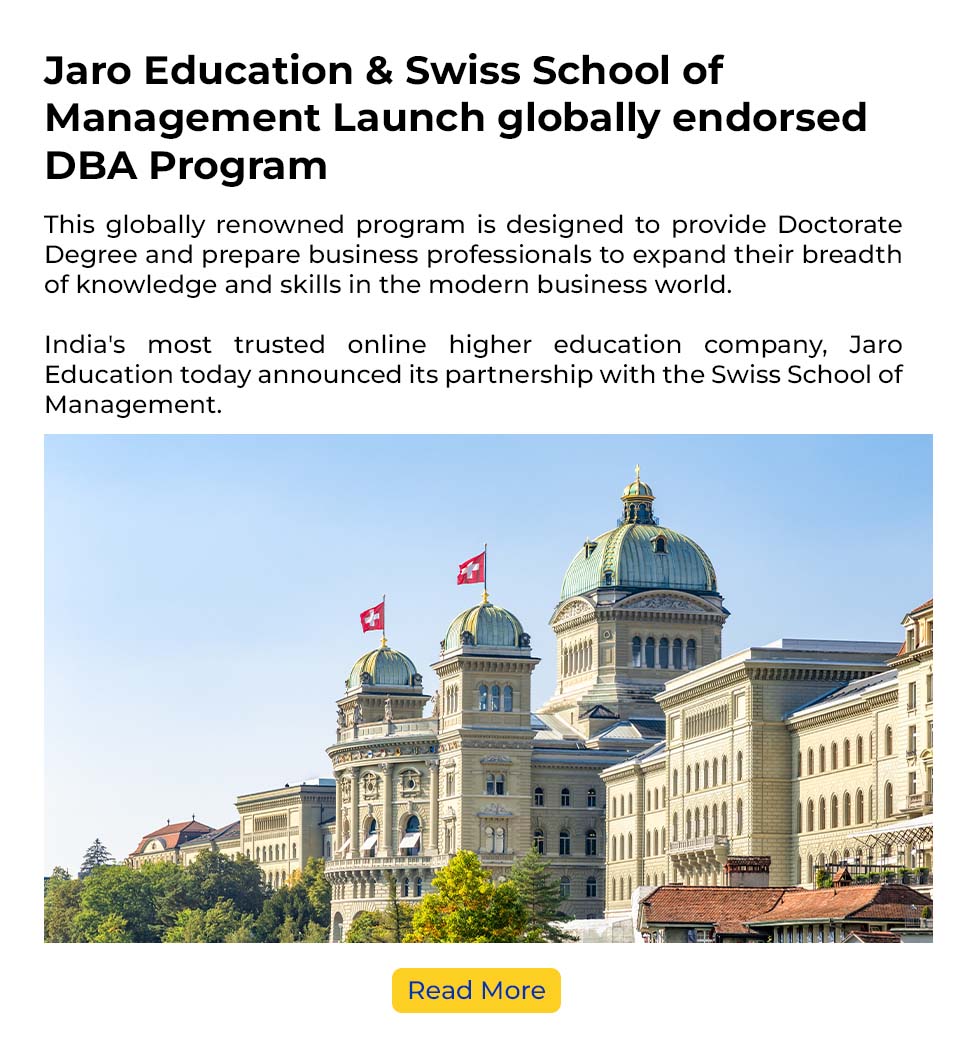
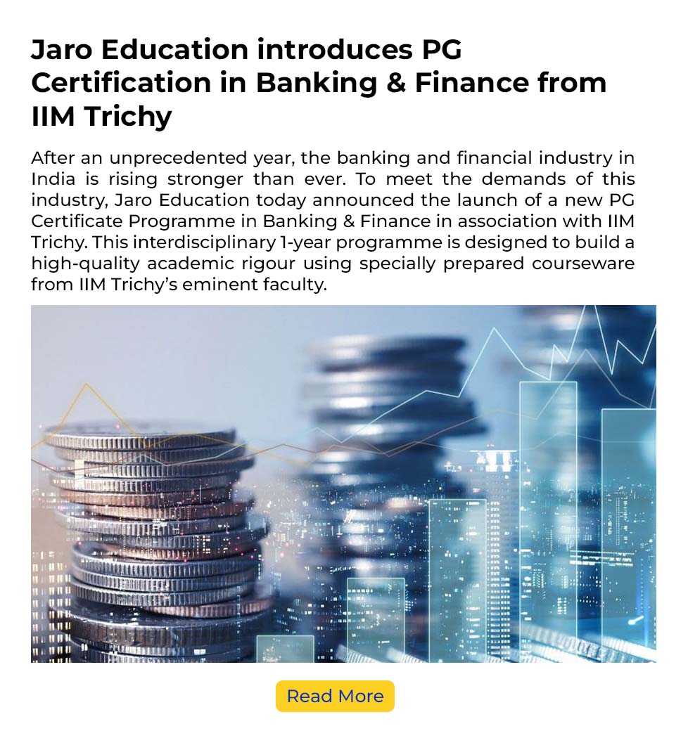
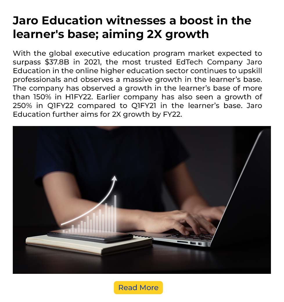
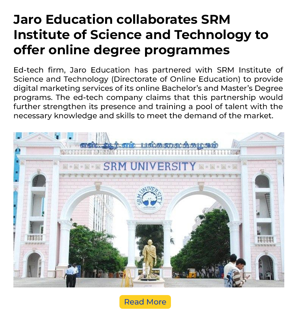
+
Number of Alumni
+
World’s Leading
Academic Partners
+
Programs from
Diverse Domains
+
Corporate Learning
Centres across India


- All Programs
- Doctorate & PhD
- Online MBA
- Online PG
- Online UG
- General Management & Leadership
- Strategy
- Analytics & Data Science
- Digital Marketing & Analytics
- Finance & Banking
- Supply Chain & Operations
- Healthcare Management
- Human Resource
- Product Management
- Cybersecurity & Cloud Computing
- Technology & Analytics


Mehak Hundal
PG Certificate Programme in FinTech
“I started my career with a postal dept to enhance my skills. I joined IIM Nagpur Fintech course from Jaro. I was actively looking for a switch to corporate banking with help of the Corporate placement team at Jaro I got the exact role which I was looking for. IIM Nagpur Fintech and Jaro placement team helped me get a hike of 40% on my previous salary.”


Satyajit Sutradhar
PG Certificate Programme in Business Analytics and Application
“Jaro’s team helped with the application process and made the procedure smooth. The learnings have been great, and the professors have done justice to the course even with less time in hand. They have duly touched majority of the topics that helped us gain lots of knowledge in the Analytics field, and we were able to explore the various use cases with examples from the industry. The course is balanced for professionals who would want to pursue their career in Business Analytics. Placement Assistant from Jaro’s team has taken the initiative to help comb through job profiles.”

Tarun Khokhar
PG Certificate Programme in Digital Strategy and Marketing Analytics
“I am currently pursuing a course from Jaro Education on Digital Marketing from IIM Nagpur. A Placement Assistant briefed me about placement assistance services, including profile building and job recommendations. One day I reached out to him for the cover letter preparation for the upcoming promotion; with their dedicated guidance, I could present myself better than other candidates and got the promotion along a good hike. I highly recommend both of them for any services related to profile building.”

Abhilekh Singh
Advanced Supply Chain Management Programme
“My sincere appreciation & gratitude to the Placement Department of Jaro Education for their efforts in imparting quality Supervision throughout the interview process. I am very grateful to the Jaro Team for effectively and sincerely helping me with constant assistance throughout. Jaro Education has been a tremendous support with regards to placements and always lent a helping hand whenever we students had any issues with the companies coming in and what they expected out of us.”

Prof. (CAPT) A. Nagaraj Subbarao
Doctor of Philosophy (PhD)
“This program is exceptionally well crafted, pedagogy is inclusive and coherent. The emphasis is on research by practice and just not on theoretical frameworks. The faculty is friendly, approachable and very competent. The program is highly recommended for a busy executive or academician interested in research and knowledge creation. Synchronous class sessions are conveniently scheduled and allow participation from students. The fact that the program is IACBE accredited adds immense value to anyone pursuing this high-quality program.”

Neha Agrawal
PG Certificate Programme in Data Science for Business Excellence and Innovation
“I always wondered how to get noticed by the companies nowadays. Getting a call from Employers is a dream of many of us, job seekers like me. I realised that the first touch of contact is a job application which mainly includes sharing a resume thus I wanted to write in praise of your expertise in profile building. Team Jaro did a remarkable job of transforming my employment history into a beautifully formatted & persuasive resume that I feel more confident now.”


2023
India’s Most Trusted Online Higher Education Company
2022
Edtech Leadership Award
2022
National Best Employer Award

2019
The Best ICT Enable Higher Education Institute Award
2018
Best Digital Learning Innovation Award
2017
Outstanding Contribution in Online Education
2012
Most Innovative & Successful Online MBA Program in India
